
WordPress: Designing a Custom Page Template (Part 1)
What’s in this Tutorial
This is Part One of a three part tutorial on creating custom page templates for WordPress. In this tutorial I will be covering the process of designing a page template. We will take a look at:
- Planning the page based on your needs.
- Wireframing the layout.
- Creating a mockup based on our wireframe and our WordPress theme’s current design.
Click here to read Part 2: Designing a Custom Page Template
Step 1: Planning
For this example, we will be building a custom “Home Page” template for a client. Let’s begin with an outline of items the page will need:
- A large “Call to Action” area that will display an animation.
- Three smaller CTA areas that are less prominent, but still stand out.
- The latest blog post.
- An email subscription form.
- The latest tweet.
Note: these are random elements I chose for this example, nothing to live by ;)
Step 2: Wireframing
This step isn’t really “necessary”, but it’s a good practice until you really get comfortable with laying out web pages. Also, your clients may want to see (or even require) wireframes in this initial stage…so let’s get to it!
Wireframes: A wireframe serves as a blueprint to the skeletal framework of a website, or in this specific case, a particular web page. There are many ways to create a wireframe; you can sketch one by hand, use a wireframe builder online or simply mock one up in your favorite design application.
I will be using Adobe Fireworks to create my wireframe. I do all of my design work in Fireworks, but you can use Photoshop, Illustrator or an equivalent.
Step 2.1: Setting up the document
The theme my “client” is using in this example will be the Bones Starter Theme by Eddie Machado. The theme is responsive, with a max-width of 1140px and uses a 12 column grid. I will setup my document to be 1340px by 1500px (I like a 100px cushion to the left and right of the design space). Here is a preview of what this looks like:
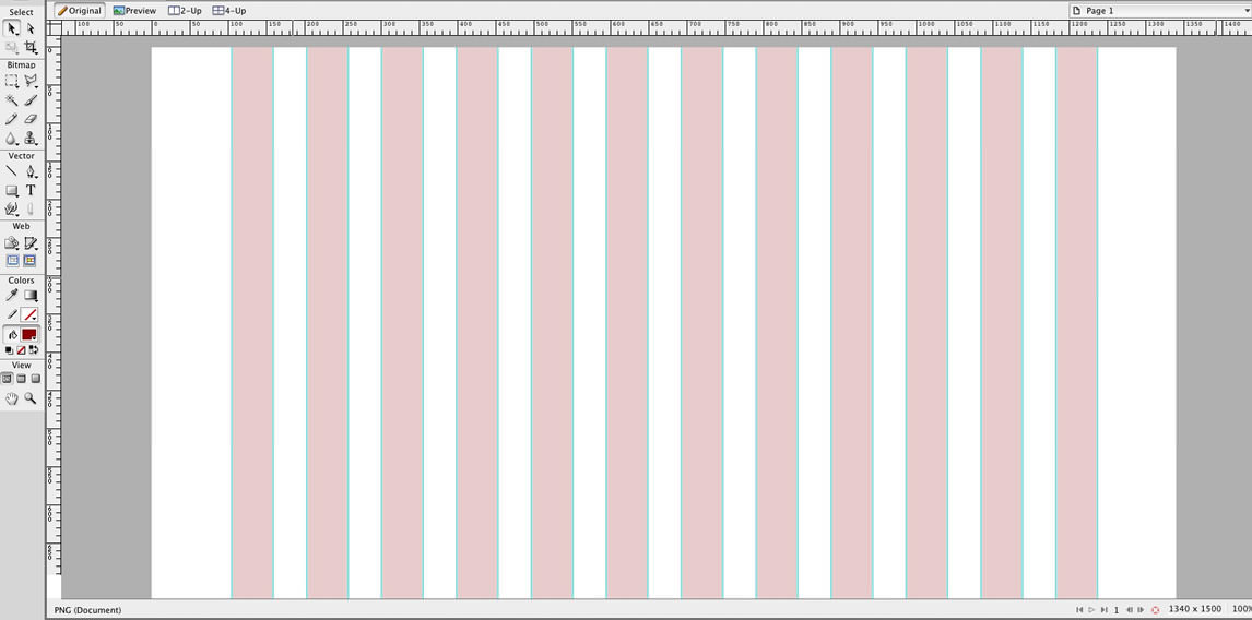
Note: since this is a theme I use frequently, I setup a template with the 1140px grid for Fireworks. This file will allow edits in Fireworks, but you can open it in any design program as it’s a .png file. Download it here: Fireworks Grid Template.
Step 2.2: Drawing the frames
Using the Rectangle Tool, I am going to draw a 12 column wide box to represent the header area that is already existing on the site (we can adjust the height later). I’m also going to draw the top CTA area spanning 12 columns and with a height of 400px.
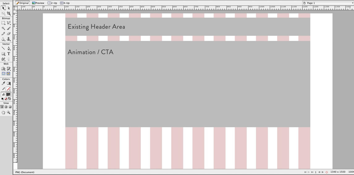
Note: I’m not going to get into page folds and concerns about placement of CTA areas etc. You can find varying opinions by searching “designing above the fold“.
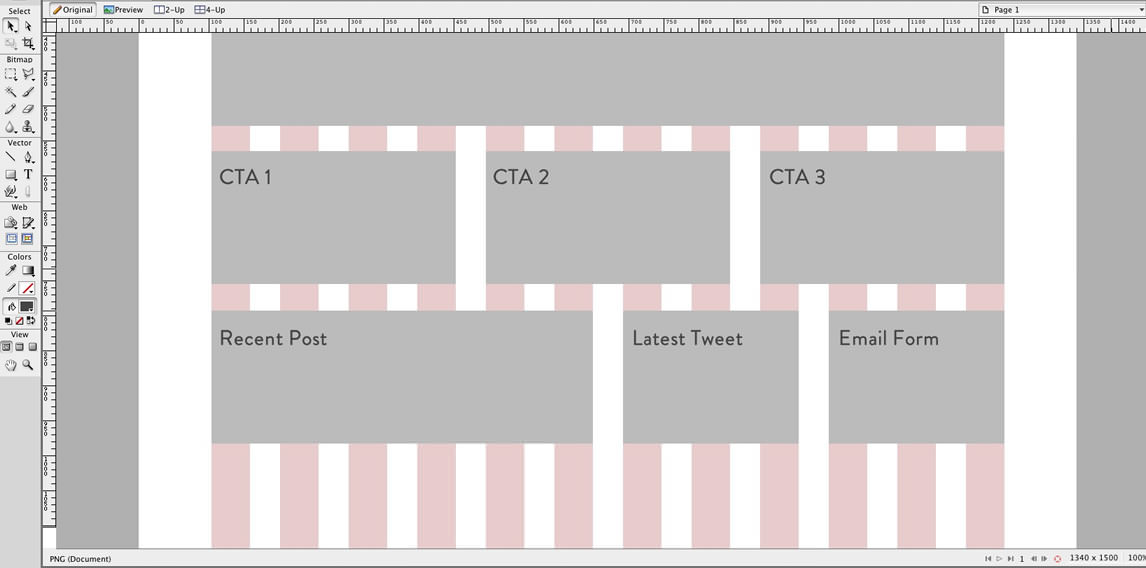
I’m going to continue this method for the rest of the page areas.
For the secondary CTA areas, I will split them into three equal areas under the main CTA. Since this is a 12 column grid, that’s 12/3 = 4 — so 4 is the number of columns we will span to get three equal ones.
I’m going to give the blog post a little more space, but I want to keep the remaining items in one row. I’ll span 6 columns for the blog post and divide the remaining columns in two for the twitter feed and email form (that’s two columns of 3).
Here is the result for the rest of our items:
Step 3: Creating a Mockup
Now that we have a basic visual of how our page should be structured, we can start adding some more design related features. Again, this step isn’t always necessary, especially if you are using an existing theme, a lot of the styles will just “happen” since they will be inherited from the stylesheet. However, if you need to show a client a visual…or if you just need one for yourself…here is a simplified way to quickly mock this up.
Note: If you need a separate wireframe and mockup, save a backup file for the wireframe at this point. From here on out we will be converting the wireframe into a mockup.
Step 3.1: Cheating
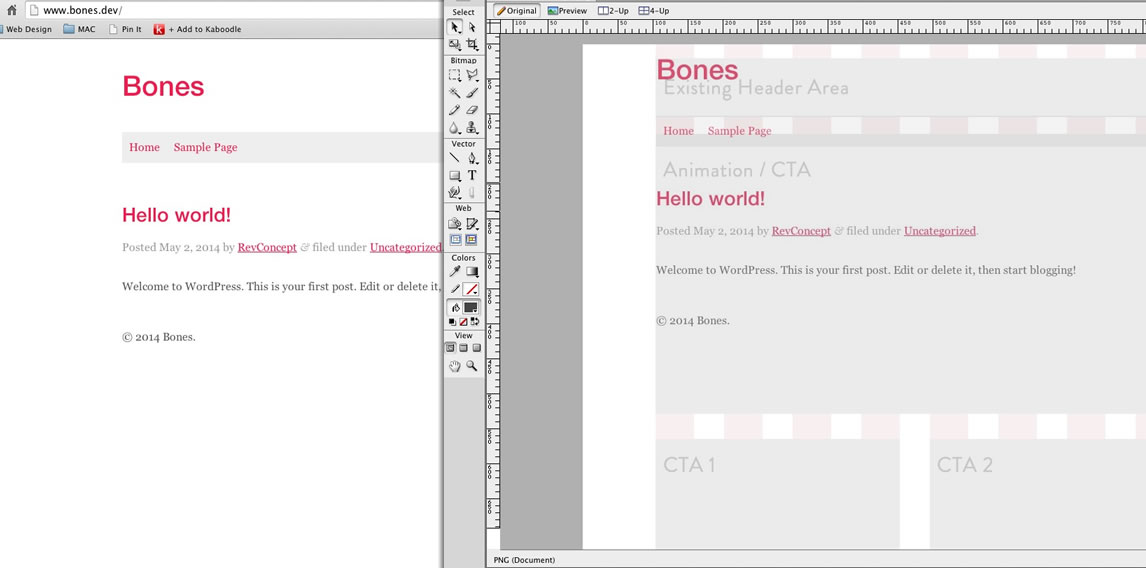
Shhhh…don’t tell anyone, but I like to take shortcuts! The simplest way to get started on laying out the design is to use what we already have. Rather than taking hours to try to match the existing elements of our theme, just take a snapshot and paste in the resulting image.
On MAC: Command + Ctrl + Shift + 3
On PC: PrtScr (“Print Screen”)
In the image below, you can see the browser image on the left and the pasted snapshot on the right. I pasted in the snapshot and then gave it an opacity of 80% so I could move it around above my wireframes to get the correct alignment:
Step 3.2: Cleaning up the “base” design
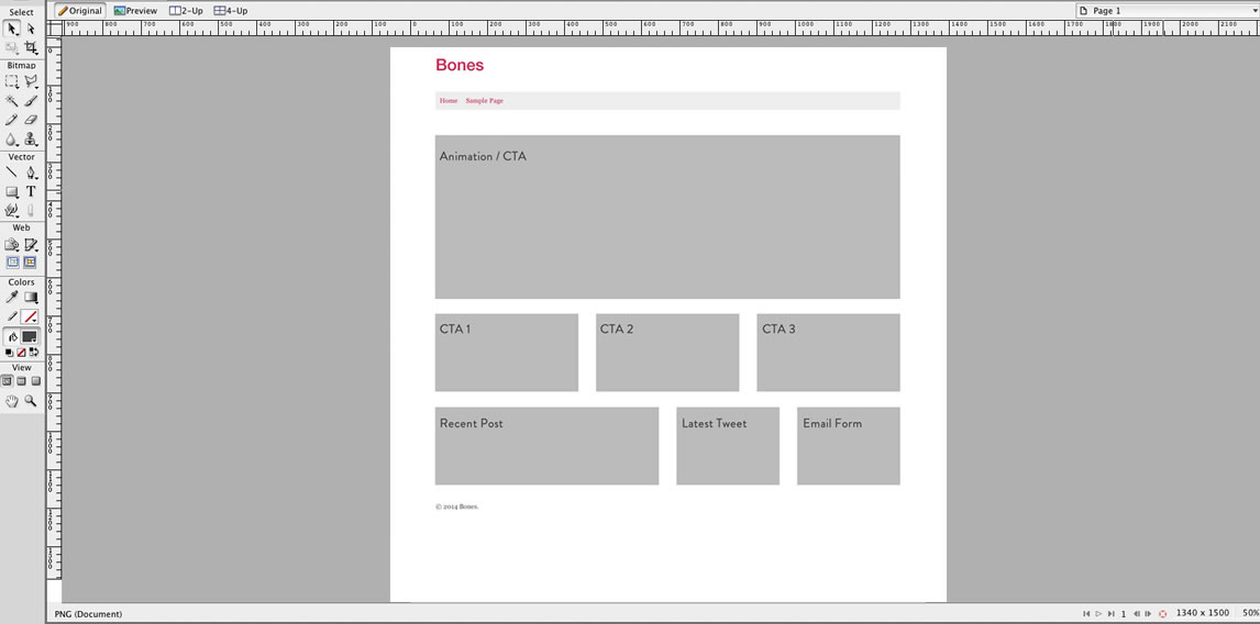
Now that we have the “base” of our design on the canvas, we can make some adjustments to clean it up.
I will begin by changing the opacity of my pasted image to 100%, and then moving it behind all of the other elements on my canvas. I’ll then remove the wireframe placeholder for the “header”. Then, I will select all of my remaining wireframes and bump them down to accommodate the height of the header in my theme. Finally, I will cut the footer (in this case that’s just the copyright info) from my pasted image and move that below my wireframes to the correct position.
Here are the results (scaled down to show the whole page):
Step 3.3: Adding design elements
Now for the fun! Here is where we start our traditional mockup process. We can add graphics, photos, headers and copy…you should use the same color schemes, font-families etc. as your existing theme. If you don’t have a particular font, you can try and download it or worse case use something similar.
I worked within the framed areas we created and came up with this:
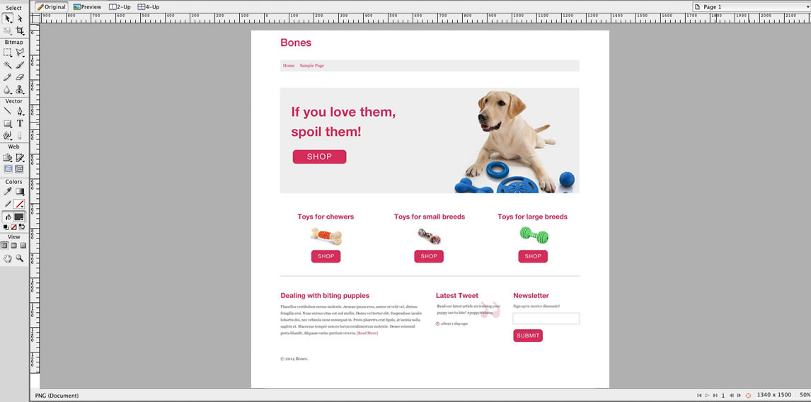
Note: I adjusted the vertical space between the rows from the wireframe version to this final version. This was just a spacing issue that I eyeballed. Don’t be afraid to do what looks right…nothing about this process is written anywhere in stone.
Conclusion
These are the basic steps to visually laying out a mockup for a page template based on a pre-existing WordPress theme. Again, this is not the only way to do this, but I hope this helps those of you who need a guide on how to get started.
Part two to this tutorial series is finished! Part two covers the process of creating the actual page template with HTML, CSS and a little bit of PHP.
Thanks for the tutorial on wire-framing in wordpress. Thats something I was really looking forward to come across.
Hey everyone, Part 2 of this tutorial is online here.
This is so awesome! I’m right in the middle of trying to learn how to make custom web designs with WordPress and this is the best post I’ve found on the internet! I’m now really looking forward to part 2 & 3 :-D
I can’t express how much i appreciate you sharing your knowledge, Thank you so much!
Oh and btw I found your site from awwwards.com just like XEL did. ;-)
I’m so glad you found it helpful…it’s hard to write these when you’ve been doing it for a while, you never know if it’s too simplified etc. I’m hoping to have part 2 done in the next week or so!
Wow, I saw your site fom awwwards.com and i must say, your website is very inspiring and sooo beautiful. I’m currently designing my own website at the moment and looking for inspiration when comes to design.
By the way, I’m so glad I came across your site as this post is very very helpful. You’re amazing!
xxx
-xel
Thank you so much for the compliments :) I’m so happy you were inspired by the site…best of luck with your design, I know it can be tedious work.
Very nice and easy to follow Chris!
Thank you!..:)