Revelation Concept Site Launch!
Finally, after nearly three years of procrastination and obsessive-compulsive redesign after redesign…Revelation Concept is back online!
Thank You
Thank you to everyone who has shown interest in this project, and to all of my friends and family that have suffered through my working on the weekends to get this done.

A huge thanks to my amazing clients, without whom non of this would even be relevant! It’s been a true pleasure working with each and every one of you…your continued support and referrals are the base of my entire business, I value you more than you know.
The Design
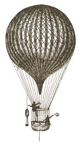
I’m obsessed with old etchings…so I knew I had to integrate those. After going back and forth (for two years) on a few heavily detailed retro-based designs, I decided to step back and took a more minimalist approach. I incorporated the idea of early science and discovery since the main purpose of this site will be to give back to the opensource community with various “How To” articles and tutorials for up and coming designers/developers. I’m really happy with the way it turned out…but it’s still a work in progress!
Most of the engraving images on this site were purchased from iStock Photo, with the remainder coming from ClipArt. The main body copy is “Georgia”, headers are “Blair ITC Med” thanks to Fonts.com. Other fonts in the headers include “Blanch” by Atipus, the ever popular and highly abused “Wisdom Script” by James Edmondson, and my logo font “Haymaker” by the hugely talented Trevor Baum.
The Development
At the last minute, I decided to take it up a notch and make this site responsive. So check that out! Huge thanks to the 1140 Gird Framework, which was a breeze to use and performs wonderfully. I used HTML5 Reset as the base for all of my WordPress development projects, with that being said…yes, this site runs on WordPress! I built a custom theme and framework around my design…it’s not quite finished, but good enough for launch day.
The Deployment
I proudly host this site at MediaTemple. I made the move to them about two years ago and couldn’t be happier with their quality service and support. I’m currently in a dedicated MySQL GridContainer, but will more than likely be moving to Dedicated Virtual Hosting in the near future.
Conclusion
I think that pretty much covers everything! Please leave your comments on this page, I would love your feedback.


My name is Steve Stone, owner of WrittenByStone.com – which is in the midst of a whole-body-redux. I’m a 70-year-old, single parent of 4 adult children (and one granddaughter) who still laugh at my jokes and bring me much joy.
I’ve been looking at various retro styles for my site changes. Your site is exactly what I was looking for…no worries I’m not going to copy it. It just combines everything I was thinking about in the same place and I absolutely love it!
It settles my fishbowl and points me to ideas I can use for my overhaul. I’m very comfortable with technology, but I wanted to make my brand as being able to combine retro style craftsmanship with today’s tech.
I especially appreciate the detail you included in this post about fonts, etc.
Well done!
Steve
Thank you for your comment, Steve! I still love the design of this site, though it’s been a while since I did it. Best of luck with your redesign!
I’m a bit late to the commenting party, but…
I love the attention to detail in your site. There are plenty of little touches that add for a great user experience that some might overlook until you find your way over to another site that has missed the UX boat. Just a very crisp, clean and well thought out design.
Kerry, thank you so much for the kind words! Usually I get tired of designs and want to rebrand, or web trends change and things look outdated but I’m still so happy with this site! I think it will be around for a while to come ;)
Amazing website!! Love the style and the design of it :))
Thank you, Katya :)
Greetings Chirs! I stumbled upon your site when searching for a particular WP tutorial and was spellbound by the concept of early science you’ve integrated here. The minimalist approach and beautiful typography brings out the charm. Hope to see more in your journal. Regards!
Thank you so much for the kind words and for taking the time to leave them! I love getting feedback like this :) I hope you find a lot more useful tidbits here…I’m trying to add content more frequently!
Hey, just randomly found your website for the avatar size in wordpress and I have to tell you it looks SO great.
Probably one of the most original yet functional websites I have come accross in years. Congrats, it’s a gem.
Thank you Hubert! I appreciate your feedback. And LOVE your avatar ;)